
These days, hundreds and thousands of infographics are produced every year but truthfully, most of them don’t tend to offer much quality in terms of their design. Often, they’ll contain a lot of good information but because the design tends to be cluttered and over thought, the information isn’t communicated very efficiently.
The whole point of using an infographic is to visually represent data, as in theory, the human brain finds it easier to digest and retain visual information.
Although there’s a lot of low quality infographics, there’s also some extremely high quality, minimal infographics too; and here are some of our favourites.
Know Your Truck Stop
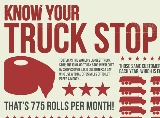 Although it might seem like a bit of a strange idea, this infographic from FindATruckingJob.com explores some pretty mindboggling facts associated with truck stops. Notice that the design is very simple and uses only three colours throughout.
View Infographic
A Brief History Of YouTube

View Infographic
A Simple (visual) Guide To Eggs

View Infographic
Inception – Explained

View Infographic
World Population Density

View Infographic
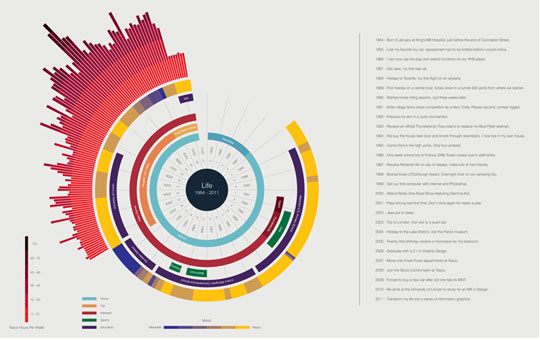
Life
View Infographic
The Perfect Pour: A Citizen’s Guide
View Infographic
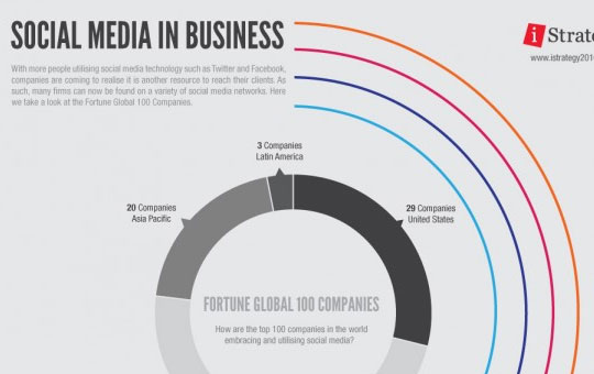
Social Media In Business
View Infographic
Death By Disease
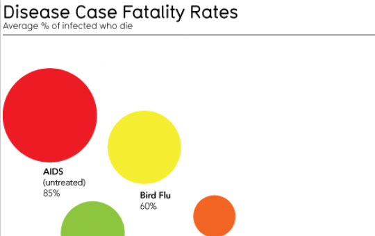
View Infographic
A Taxonomy Of Ideas
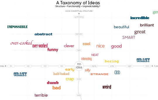 Here’s another extremely minimal infographic from InformationIsBeautiful.net that gives a visual representation of the taxonomy of ideas. Essentially, it’s just a graph, but it works well.
View Infographic
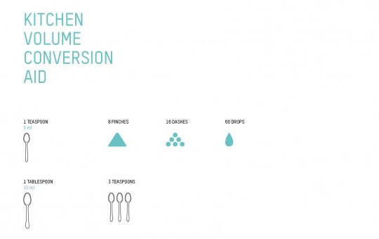
Kitchen Volume Conversion Aid
View Infographic
How Would You Like Your Graphic Design
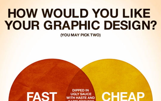 This infographic makes use of a venn diagram to explore various outcomes of a graphic design project depending on your priorities. Do you always demand great work at a low cost? Take a look at the infographic to find out what to expect.
View Infographic
10 Artists, 10 Years: Color Palettes
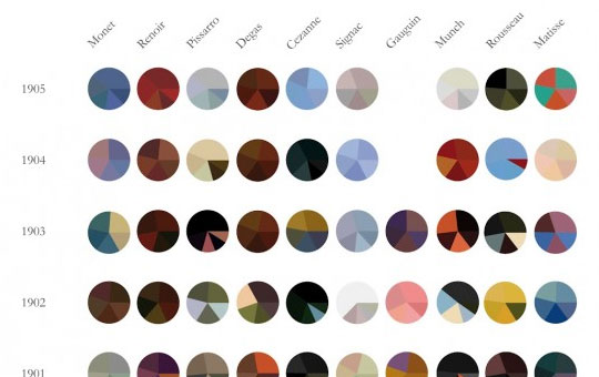 This infographic takes us through ten years of art history across ten different artists. It’s clean, well-organised, informative and minimal.
View Infographic
Wine Pairing Chart
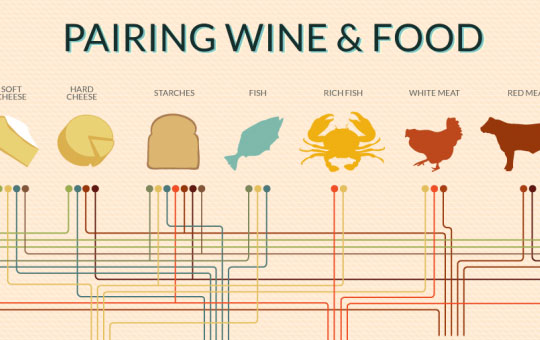 Ever wondered what wine to pair with your meal? This infographic will answer your question as it pairs various foods with various wines. It’s simple yet very informational.
View Infographic
The Apple Tree
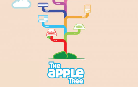 Apple infographics are plentiful but this one from Mashable is certainly one of the best. It takes us on a journey through the various products released by Apple over the years in a minimalistic, tree-format.
View Infographic
Are You Happy?
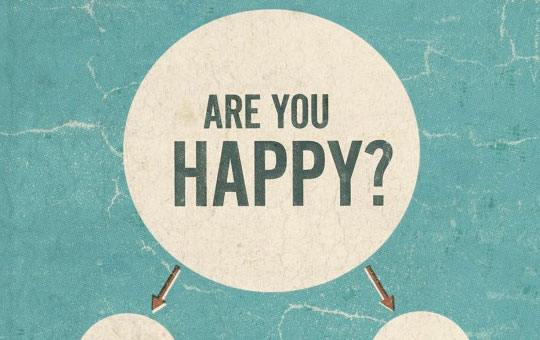 Are you happy? Not sure? Find out with this smart, yet minimalistic infographic from Typcut.com. We should all look at this every morning when we wake up.
View Infographic
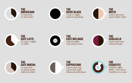
An Illustrated Guide To Coffee Drinks
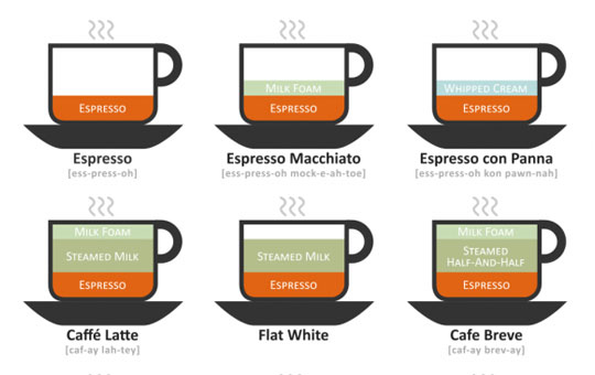 Ever wondered what the difference is between all those coffee’s down at your local Starbuck’s? If so, take a look at this infographic and you’ll soon find out.
View Infographic


 2026")
 2026")


